Board index » Word on the Street... » Sports


Post new topic Reply to topic  [ 149 posts ]  Go to page 1, 2, 3, 4, 5 ... 8  Next
Author Message
 Post subject: color/logo changes for the worse
PostPosted: Tue Dec 22, 2009 5:31 pm 
Offline
User avatar
Former PJ Drummer
 Profile

Joined: Mon Nov 22, 2004 6:39 pm
Posts: 16154
Location: burbs
examples....

Image
to
Image

i still haven't gotten over this. they took one of the coolest symbols and most original color schemes in hockey and made it into that shit...some webbed foot, D thing. not only that, they took the "mighty" out. atrocious.

Image
to
Image

come on....that M-B was classic.


Top
 
 Post subject: Re: color/logo changes for the worse
PostPosted: Tue Dec 22, 2009 6:14 pm 
Offline
User avatar
Administrator
 Profile

Joined: Sat Oct 16, 2004 10:53 pm
Posts: 20537
Location: The City Of Trees
Completely disagree with you on the Ducks, but fully agree on the Brewers.

Two that come to mind immediately are the Blue Jays and Rams.


Top
 
 Post subject: Re: color/logo changes for the worse
PostPosted: Tue Dec 22, 2009 6:16 pm 
Offline
User avatar
See you in another life, brother
 Profile

Joined: Mon Apr 18, 2005 7:01 pm
Posts: 13165
Gender: Male
49ers

_________________
"Socialism never took root in America because the poor see themselves not as an exploited proletariat but as temporarily embarrassed millionaires."
-- John Steinbeck


Top
 
 Post subject: Re: color/logo changes for the worse
PostPosted: Tue Dec 22, 2009 6:21 pm 
Offline
User avatar
Former PJ Drummer
 Profile

Joined: Mon Nov 22, 2004 6:39 pm
Posts: 16154
Location: burbs
Green Habit wrote:
Two that come to mind immediately are the Blue Jays and Rams.

definitely for the jays and speaking of the rams...why do so many blue/yellow teams go navy/gold?


Top
 
 Post subject: Re: color/logo changes for the worse
PostPosted: Tue Dec 22, 2009 6:43 pm 
Offline
User avatar
Administrator
 Profile

Joined: Sat Oct 16, 2004 10:53 pm
Posts: 20537
Location: The City Of Trees
mowbs wrote:
Green Habit wrote:
Two that come to mind immediately are the Blue Jays and Rams.

definitely for the jays and speaking of the rams...why do so many blue/yellow teams go navy/gold?
It's not just the blue--tons of teams (Rams, Pens, Idaho Vandals) switched their yellow for gold, and it looks worse.


Top
 
 Post subject: Re: color/logo changes for the worse
PostPosted: Tue Dec 22, 2009 7:25 pm 
Offline
User avatar
Supersonic
 Profile

Joined: Mon Oct 18, 2004 3:04 am
Posts: 12383
Gender: Male
I think both Ducks sucked...the name of the team and all its uniforms;

Totally agree with you on the Brewers;

Thought the Pistons switch was for the worse, but then they sort of switched back to the original colors so that was cool;

Think the Red Sox tinkering with its away uniforms (and introduction of Sox hat) was lame;

Prefer the original Utah Jazz uniforms;

Don't like how hockey teams now wear white on the road.

_________________
RIP Mr. Dirty Frank


Top
 
 Post subject: Re: color/logo changes for the worse
PostPosted: Tue Dec 22, 2009 7:29 pm 
Offline
User avatar
Got Some
 WWW  Profile

Joined: Sun Oct 17, 2004 2:51 pm
Posts: 2869
Location: Appalachian Hills of Tennessee
Gender: Male
Image

to

Image

to


Image

to


Image


to

Image


just go back to the original already

_________________
Image


Top
 
 Post subject: Re: color/logo changes for the worse
PostPosted: Tue Dec 22, 2009 7:40 pm 
Offline
User avatar
Former PJ Drummer
 Profile

Joined: Mon Nov 22, 2004 6:39 pm
Posts: 16154
Location: burbs
i hate the newest hawks jerseys.

on the brewers...i actually do like when baseball hats are just leter(s) that rep the city.


Top
 
 Post subject: Re: color/logo changes for the worse
PostPosted: Tue Dec 22, 2009 7:47 pm 
Offline
User avatar
Resident Frat Dick
 Profile

Joined: Sat Mar 19, 2005 7:50 pm
Posts: 10229
Location: WA (aka Waaaaaaaahhhh!!)
Gender: Male
Image

to

Image


???

_________________
Image

9/16/96, 7/21/98, 7/22/98, 11/5/00, 11/6/00, 12/5/02, 12/8/02, 12/9/02, 5/30/03, 10/22/03, 9/24/04, 3/18/05, 9/1/05, 9/2/05, 7/23/06, 9/21/09, 9/22/09, 9/26/09, 9/25/11


Top
 
 Post subject: Re: color/logo changes for the worse
PostPosted: Tue Dec 22, 2009 7:53 pm 
Offline
Got Some
 Profile

Joined: Mon Oct 18, 2004 8:28 pm
Posts: 2573
Location: CT
Image
to
Image


Top
 
 Post subject: Re: color/logo changes for the worse
PostPosted: Tue Dec 22, 2009 7:54 pm 
Offline
User avatar
Reissued
 WWW  Profile

Joined: Sun Oct 24, 2004 3:38 pm
Posts: 20059
Gender: Male
agreed on the ducks (especially the away jerseys)

aprilfifth wrote:
49ers


i agree, but the change is not as terrible as some of the other ones that have happened.

_________________
stop light plays its part, so I would say you've got a part


Top
 
 Post subject: Re: color/logo changes for the worse
PostPosted: Tue Dec 22, 2009 8:29 pm 
Offline
User avatar
Got Some
 Profile

Joined: Fri Sep 02, 2005 8:52 pm
Posts: 2647
Location: Where gila monsters meet you at the airport
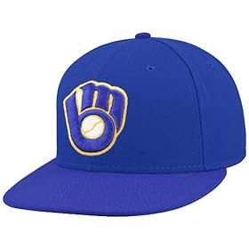
Yeah, the loss of the mitt Brewers logo is bad. I loved that one.

As an alum, I have long been annoyed at the University of Arizona. The school started out with the colors green and silver, which are great desert colors ... but then one yet they needed new uniforms and of course blue and red stuff was much cheaper ... so they just changed the school colors. Lame.


Top
 
 Post subject: Re: color/logo changes for the worse
PostPosted: Tue Dec 22, 2009 8:30 pm 
Offline
User avatar
Got Some
 Profile

Joined: Fri Sep 02, 2005 8:52 pm
Posts: 2647
Location: Where gila monsters meet you at the airport
Bammer wrote:
Image

to

Image


???


Everything is messed up with this one.

Changing Bullets to Wizards was asinine in the first place. And all of the Wizards jerseys have been embarrassing.


Top
 
 Post subject: Re: color/logo changes for the worse
PostPosted: Tue Dec 22, 2009 8:36 pm 
Offline
Yeah Yeah Yeah
 Profile

Joined: Mon Oct 18, 2004 2:12 am
Posts: 3783
Those Wizards jerseys are the ugliest in sports. Only the Oregon Ducks could rival them.


Top
 
 Post subject: Re: color/logo changes for the worse
PostPosted: Tue Dec 22, 2009 8:37 pm 
Offline
User avatar
Administrator
 Profile

Joined: Sat Oct 16, 2004 10:53 pm
Posts: 20537
Location: The City Of Trees
dkfan9 wrote:
agreed on the ducks (especially the away jerseys)

aprilfifth wrote:
49ers


i agree, but the change is not as terrible as some of the other ones that have happened.
We're very lucky they didn't follow through with this monstrosity.
Image


Top
 
 Post subject: Re: color/logo changes for the worse
PostPosted: Tue Dec 22, 2009 8:40 pm 
Offline
User avatar
Red Mosquito, my libido
 Profile

Joined: Sun May 21, 2006 2:02 am
Posts: 91597
Location: Sector 7-G
Image

_________________
It takes a big man to make a threat on the internet.


Top
 
 Post subject: Re: color/logo changes for the worse
PostPosted: Tue Dec 22, 2009 8:41 pm 
Offline
User avatar
See you in another life, brother
 Profile

Joined: Mon Apr 18, 2005 7:01 pm
Posts: 13165
Gender: Male
dkfan9 wrote:
agreed on the ducks (especially the away jerseys)

aprilfifth wrote:
49ers


i agree, but the change is not as terrible as some of the other ones that have happened.

The new ones aren't terrible, but the old were just that good. Loved the red top with white numbers, and the gold pants. Those jerseys were perfect. The first few years when they switched they were doing white pants and that was rough. The new tops with gold pants aren't too bad.

_________________
"Socialism never took root in America because the poor see themselves not as an exploited proletariat but as temporarily embarrassed millionaires."
-- John Steinbeck


Top
 
 Post subject: Re: color/logo changes for the worse
PostPosted: Tue Dec 22, 2009 8:42 pm 
Offline
User avatar
Supersonic
 Profile

Joined: Mon Oct 18, 2004 3:04 am
Posts: 12383
Gender: Male
I wasn't happy when Syracuse added numbers to its football helmets.

_________________
RIP Mr. Dirty Frank


Top
 
 Post subject: Re: color/logo changes for the worse
PostPosted: Tue Dec 22, 2009 8:43 pm 
Offline
User avatar
Red Mosquito, my libido
 Profile

Joined: Sun May 21, 2006 2:02 am
Posts: 91597
Location: Sector 7-G
Wasn't the old Brewers logo technically illegal as there is some rule in the MLB rulebook that says you can't include a depiction of a baseball on your uniform?

_________________
It takes a big man to make a threat on the internet.


Top
 
 Post subject: Re: color/logo changes for the worse
PostPosted: Tue Dec 22, 2009 9:06 pm 
Offline
User avatar
Supersonic
 Profile

Joined: Mon Oct 18, 2004 3:04 am
Posts: 12383
Gender: Male
cutuphalfdead wrote:
Wasn't the old Brewers logo technically illegal as there is some rule in the MLB rulebook that says you can't include a depiction of a baseball on your uniform?


:calling Peter Gammons, Mr. Gammons to RM"

_________________
RIP Mr. Dirty Frank


Top
 
Display posts from previous:  Sort by  
Post new topic Reply to topic  [ 149 posts ]  Go to page 1, 2, 3, 4, 5 ... 8  Next

Board index » Word on the Street... » Sports


Who is online

Users browsing this forum: No registered users and 8 guests


You cannot post new topics in this forum
You cannot reply to topics in this forum
You cannot edit your posts in this forum
You cannot delete your posts in this forum
You cannot post attachments in this forum

Search for:
Jump to:  
It is currently Thu Jan 15, 2026 4:38 pm